Fucking THANK YOU. It’s like all the automotive interior designers just hotboxed themselves for a decade with all the unnecessary and less useful touch interfaces and are finally coming back down to earth.
Please explain a non-touch design that allows all following functions: bluetooth pairing, equalizer adjustment, controlling volume of parking sensors, displaying oil levels, tire pressure, breaks wear, and other nice sensors your modern car is equipped with. How about adjusting the heat level of the seat heating? How about disabling mirror auto-adjustment when you shift into reverse?
A modern car needs a touch screen.
It also desperately needs hardware buttons for core features, e.g. volume, AC, lighting.
you… you can’t think of how to interact with a computer without a touch screen?
I’m so old.
All these things can be performed with a turning knob, a touch screen is not mandatory in a car
And how many knobs do you want in your car? 50?
I have one and a few buttons in my car, BMW has the iDrive knob. So, one is enough.
Most of the things you listed can - and have - been done with physical controls at one point or another. It was nice, because you could do it by feel and memory after you got used to your car.
The modern perception of “car” is so, so different from the one I grew up with, and I’m not that old - I learned to drive in the early naughties
I think what you’re missing is that no touch screen does not mean no screen whatsoever.
My Honda from the transition years has a nice big screen that is touch-capable, but it also has a nice knob in the middle that can spin to scroll through lists, but also rocks up/down/left/right and pushes in for select. When I describe it in text it sounds complicated but it’s really quite intuitive and can be used without looking for all the basics.
I like a hybrid, tbh. My car has a sizeable touchscreen that android auto connects to, and I use it a lot for media and navigation.
But things like climate control have physical buttons. Works really well for me and I like the combination approach.
Yeah I don’t mind the combo as long as the important stuff you interact with regularly is still physical. If I have to go into a menu to change climate controls, you have officially fucked up.
You always must look at a touch screen to press a button. There’s no reason to use a touchscreen interface for anything a driver might want to do while driving.
I have the same gripe with TV remotes.
Dude I have such a hate for the “new” Samsung Smart TV remote. They literally took away all but the BARE essential buttons. And for what ??? Does the remote look cool and sleek now? Maybe? But I can’t fucking use it anymore.
Meanwhile LG is being a chad: they keep all the buttons, but additionally give me a super cool and convenient pointer (LG remote for comparison).
Wait… But what buttons are missing that you actually use?! Maybe I’ve just gotten too used to my remote, but I don’t think I’ve ever wanted for another button on the remote, aside from maybe a source button.
Source, Settings and Quick Settings are buttons I find myself using quite often. Also the numbers do come in handy every now and again, as someone who still occasionally watches live TV.
Now the Samsung remote does have an “Extra” button, but last time I tried using that on a friends TV it told me “this functionality is unavailable”. After 3 minutes of searching, I finally gave up on setting the TV to Game Mode and instead just lived with the input lag.
The touchscreen in my 2016 Jeep Renegade is big enough for me to be able to read everything I need to without having to squint, and small enough that I don’t have to stare at it all the way until the button press (I can eyeball it, get my eyes back on the road, and press the screen in the correct spot 95% of the time). Screens like this I like. One’s like those in Tesla’s are criminally unsafe.
The worst I’ve ever seen was needing to interact with the touchscreen to open the glove box. Absolutely ridiculous.
This can’t be real
It is, I’ve seen it on a car review recently but I can’t remember which.
One of the worst ones is the new BMW 7 series that uses capacitive screens to change the air vent positions, as does opening the car door. MKBHD accidentally opened the door while trying to use the vents (about 5mins 40 seconds, not sure how to share the link in the correct time position from the app)
Oof
My Model 3 is like this. (Please don’t judge, I’ve had it for six years.) Thankfully I don’t need to get into the glovebox very often but on the other hand that means I can never remember how to do it. It sucks balls.
All good I remember considering a Tesla too
Same with mine. That was something I was looking for when I bought this car actually. I wanted physical buttons and knobs for everything that wasn’t infotainment system related. The steering wheel has buttons to control things like volume and tack/station skipping as well. Even having a physical shifter was a necessity for me because these button or weird electronic shifters are a pain in my ass and can potentially be dangerous if you’re unfamiliar.
Right! The design for climate control and radio adjustments should just be buttons.
The touch screen should be a display for android auto and carplay as it is an addition not a replacement.
Hopefully as economies of scale apply more to evs there will be less justification to cut down on costs in favour of touch screens doing everything.
I drive a car built in 2018 and I’m really happy with the balance between buttons and screen.
I’ve got stalks for indicators, wipers and cruise control. Physical switches for lights, windows, mirrors, climate temp, fan, air source, defrost front and rear, odometer reset, driving mode, master door unlock and opening the boot/tailgate. Vents are manually operated and the glovebox and fuel tank flap are too. The steering wheel has physical buttons for media source, track skip/radio seek, phone calls, starting the voice control mic, and scroll wheels for volume and cycling through information displays on the small screen between the large analogue gauges on the dashboard. And a 10 inch touchscreen for everything else (reverse camera, media and maps, mostly, but includes all the car settings you don’t fiddle with often, like light delays, beep volumes, summer time offset etc.).
Basically anything I’m likely to want to use whilst driving I can find and operate with at most a quick glance, if not by touch alone, and have immediate feedback that I got it right because I felt the switch/stalk/button move under my fingertips as I expected.
I’ve wondered what functions I’d be happy with moving from a physical control to the touchscreen or capacitive button. I haven’t come up with a single one. Yet if I were to buy the latest version of this car just about anything that is currently a physical button is now a capacitive touch button. Yeah, no thanks.
You know he is referring to a 2023 article right?https://slate.com/business/2023/04/cars-buttons-touch-screens-vw-porsche-nissan-hyundai.html
And so is the video.
I really don’t see any improvements lately
I was thinking the same thing. Posting a video that’s 1 year old with no new info is pretty weird.
My cat’s touchscreen is broken. It wouldn’t stop registering a constant input from one corner. They told me it would be thousands to fix. Now it’s more broken and won’t accept any input. That makes it actually functional since I can use the buttons and knobs to do things that were being over ridden by the screen input.
Return to Button 🐒
I’m really growing to appreciate them after hearing about the user design horror stories
My thoughts exactly when I saw the title.
“Reject screen, return to button.”
It shouldn’t even be legal to not have buttons for everything but CarPlay/Android auto (which should still be required to have buttons/knobs for volume and skip forward/back)
And for the sake of fuck, analog dials! I don’t want my volume knob to only go up or down by two when I spin it. Each click should be a change!
Then don’t but from automakers that save 8cents a car by buying less featured switches.
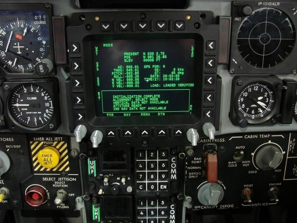
I feel like this is a problem already well-studied and solved by industry, particularly aviation and rail.
A hybrid interface like this one (obviously with more advanced graphics) seems so obviously the way to go.

One of the reasons that my last vehicle purchase was a Honda is because they have kept the climate control buttons and the volume knob for the radio. I decided against a few brands because they had those things into a shitty touchscreen.
Now if they could just get a more responsive touchscreen model I would be even happier!
The fact you have to watch out for a physical volume knob nowadays is wild. Imo the shitty implementation winner is by far Renault with the ZE50 EV. Its radio has a permanent volume touch button, which opens a new view with touch buttons for volume up and down.
Whichever Renault engineer or executive thought that this was a good idea in any way, shape or form deserves many punches to the face. Apparently later models now have permanent touch buttons for volume up and down, which I guess is at least slightly better (although still horribly inferior to a knob).
It’s worth noting that there are steering wheel volume buttons for the driver, but it’s still horrible and sucks for passengers.
20 years from now someone on the internet is going to post “Remember back when we were so addicted to tablets that they replaced our car AC buttons with them?”
Fuckin’ finally.
Take my 2014 Crosstrek and jam the drivetrain from the Ioniq 5 in it, change nothing else, and I’ll buy two.
Unless you’re BYD, and then you got rocker switches that look like buttons, just to throw you off.
yay
Thats great!


